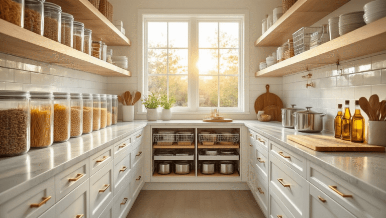
Why Your 3×3 Bedroom Doesn’t Have to Look Like a Prison Cell
Contents
- Why Your 3×3 Bedroom Doesn’t Have to Look Like a Prison Cell
- The Sweet Spot: Making Your 5×5 Bedroom Actually Livable
- Going Big: 10×10 Luxury Bedroom Designs That Don’t Look Empty
- Furniture Choices That Make or Break Your Design
- Design Details That Separate Amateur Builds from Pro-Level Rooms
- Aesthetic Bedroom Styling: Creating Cohesive Themes
Small bedrooms in Bloxburg feel impossible until you crack the code. I used to think you needed massive grid space to create anything decent. Total lie.
My favorite trick? Go with a classical kids bedroom vibe. I know what you’re thinking—”I don’t want a kids room!” But hear me out.

Children’s furniture in Bloxburg is proportionally smaller, which means you can actually fit stuff without your room looking like a hoarder’s paradise.
Here’s what you need in a 3×3 space:
- A bed (obviously, but choose the smallest one that still looks decent)
- A reading chair in the corner
- A tiny reading nook with a small bookshelf vibe
- One decorative item max—seriously, resist the urge
I learned this the hard way when I crammed seven dresses, three paintings, and a full seating area into my first 3×3 bedroom. It looked absolutely ridiculous. Less is more when you’re working with limited space, even in a virtual world.
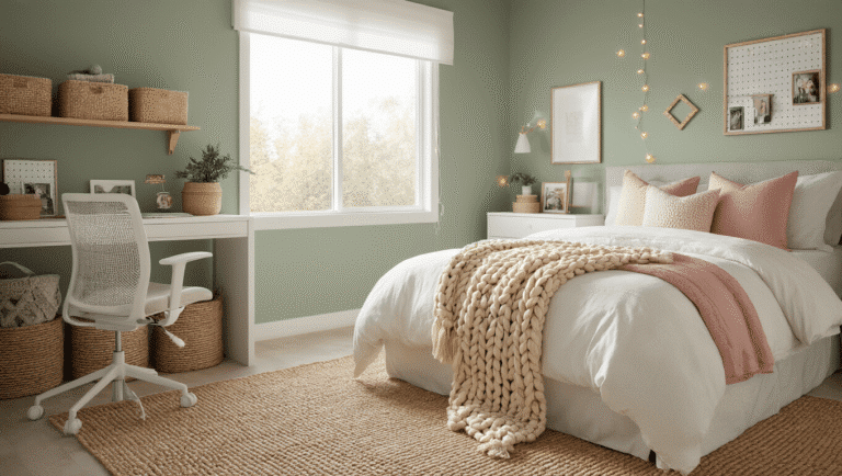
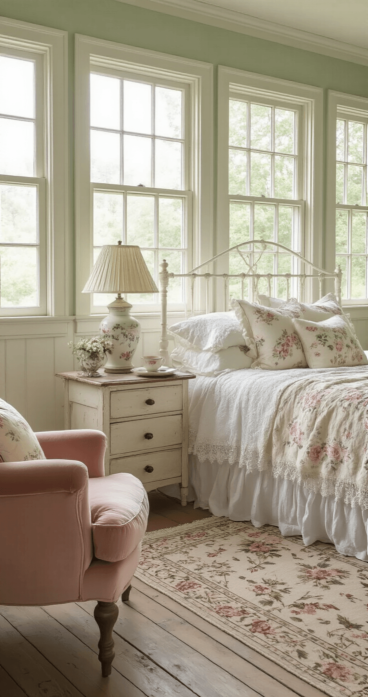
The Sweet Spot: Making Your 5×5 Bedroom Actually Livable
This is where Bloxburg bedrooms get fun. A 5×5 grid gives you enough room to breathe without overwhelming you with empty space you don’t know how to fill.
I’ve built probably thirty different 5×5 bedrooms, and they’re honestly the perfect size for experimenting.
You can realistically include:
- A proper bed area with space to walk around it
- A seating section that doesn’t look forced
- Closet space (because where else are all those outfits going?)
- A small bathroom if you’re feeling fancy
My personal go-to layout:
I put the bed against the back wall, centered. Then I create a mini seating area in one corner with a comfy chair and a side table. The closet goes in the opposite corner. This creates natural “zones” without needing walls everywhere.
One time I tried putting the bed in the middle of the room like some fancy hotel suite. Worst decision ever. You couldn’t walk anywhere without bumping into something, and it just felt awkward. Stick to walls for your major furniture pieces—trust me on this.
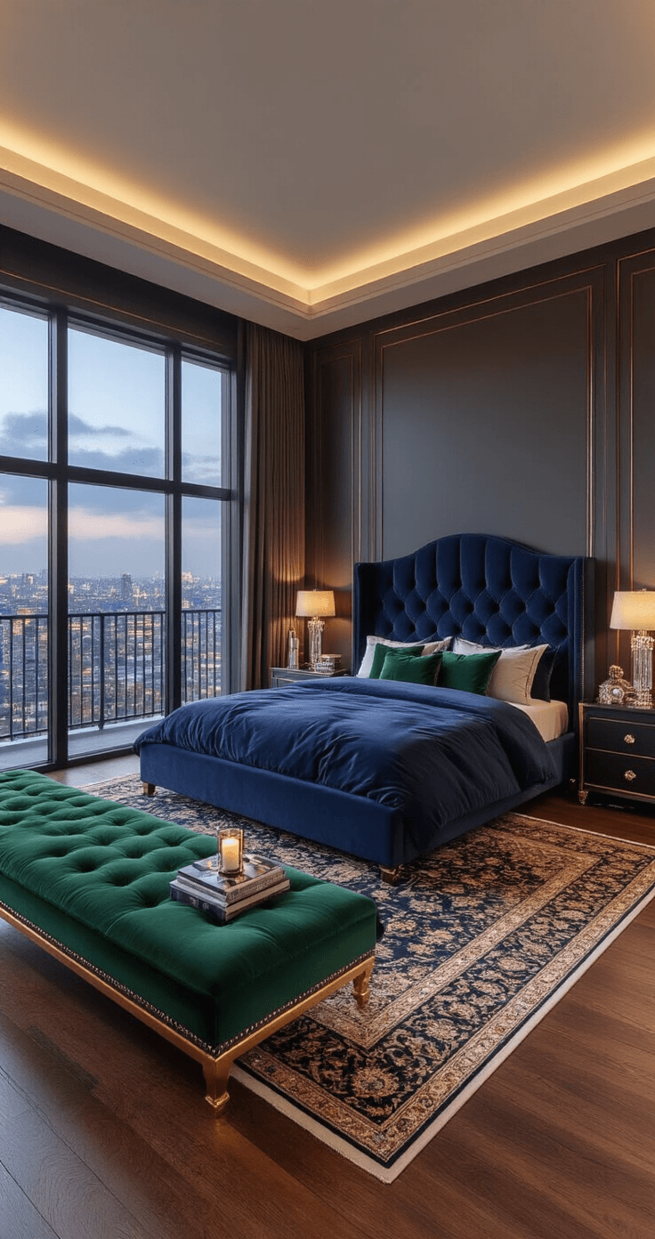
Going Big: 10×10 Luxury Bedroom Designs That Don’t Look Empty
Large bedrooms are a blessing and a curse. Too much empty floor makes your room look unfinished. Too much clutter makes it look like a furniture store exploded.
I spent weeks perfecting my first 10×10 luxury bedroom, and honestly, it taught me more about design than any YouTube tutorial.
What you can actually fit in a 10×10:
- Full bedroom area with a king-sized bed
- A balcony seating section
- Chaise lounges for that “I’m rich” aesthetic
- Decorative displays that show off your style
- Multiple rugs to define each zone
- Room for actual walking paths
The secret? Think in sections. I divide the space mentally into quadrants. Bedroom quadrant. Seating quadrant. Display quadrant. Bathroom or closet quadrant. Each section gets its own purpose and stays in its lane.
When I added a chaise lounge to my first big bedroom, everything clicked. Suddenly it looked intentional instead of randomly thrown together.
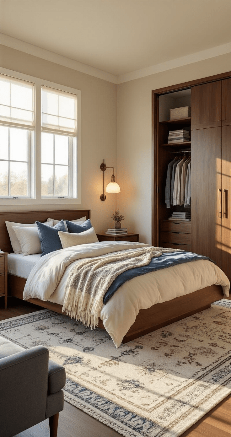
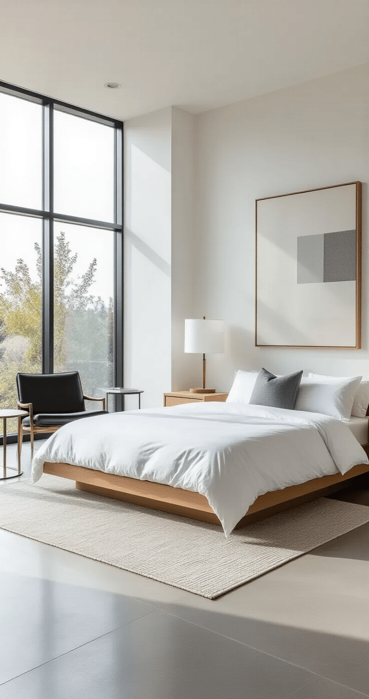
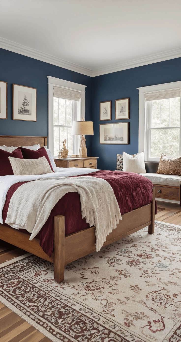
Furniture Choices That Make or Break Your Design
Dresses and decorative items are your secret weapons. I hang dresses on walls in walk-in closet areas. They fill space beautifully and add that lived-in feeling that empty walls never give you.
Bedside tables: Do this instead
Forget the boring lamp-on-a-table combo everyone does. I use bedside tables with decorative candles instead. Looks fancier. Takes up the same space. Gives off this boutique hotel vibe that regular lamps just don’t deliver.
Paintings above the bed
This is non-negotiable for me now. A painting above your bed creates an instant focal point. Your eyes go there first when you enter the room. I made the mistake once of putting a tiny painting above a massive bed. Looked ridiculous—like a postage stamp on a billboard. Go big or skip it entirely.
Seating areas that actually make sense
Chaise lounges and ottomans aren’t just fancy decoration. They create relaxation zones in your bedroom. I put a chaise lounge near a window with a small coffee table next to it. Boom—reading nook that looks intentional. Add a decorative throw pillow or two, and suddenly you’ve got a whole vibe going.
Design Details That Separate Amateur Builds from Pro-Level Rooms
Custom wallpaper changed everything for my Bloxburg builds. I used to slap the same white walls on everything. Boring. Lifeless. Forgettable. Now I layer in wallpaper that matches my theme. Floral for cottagecore vibes. Geometric for modern looks. Textured for that expensive boutique feel.
Coffee tables with books
Here’s a styling trick I stole from real interior designers. Coffee tables look naked by themselves. Add a stack of books (even virtual ones), and suddenly your seating area looks sophisticated instead of empty. I cluster three books of different sizes on every coffee table now. Works every single time.
Strategic window placement
Windows aren’t just about outside views. They’re about natural lighting within your room. I place windows to create light patterns that highlight specific areas. Want your seating nook to stand out? Put a window right behind it. Want your bed to be the star? Flank it with windows on either side.
Carpets for zone definition
This trick feels so obvious now, but it took me forever to figure out. Carpets tell your brain “this is a separate area.” I put one carpet under my bed area. A different carpet under my seating section. Maybe a runner in my closet space. Each carpet creates a visual boundary without needing actual walls. Your brain registers these as different “rooms” even though they’re all in the same space.
Aesthetic Bedroom Styling: Creating Cohesive Themes
Random decor is the enemy of good design. I learned this after creating a bedroom with beach decor, gothic candles, and modern furniture all mixed together. It looked like a tornado hit three different stores.
This post may contain affiliate links. Please see my disclosure policy for details.